Choosing the right layout for your Wakelet collection
Which Wakelet layout works best for your collection?
We were excited to provide you with a look at the 5 unique ways you can organize your collections on Wakelet!
Discover how Media View, Compact View, Grid View, Mood Board and Column View can elevate your collections to new heights.
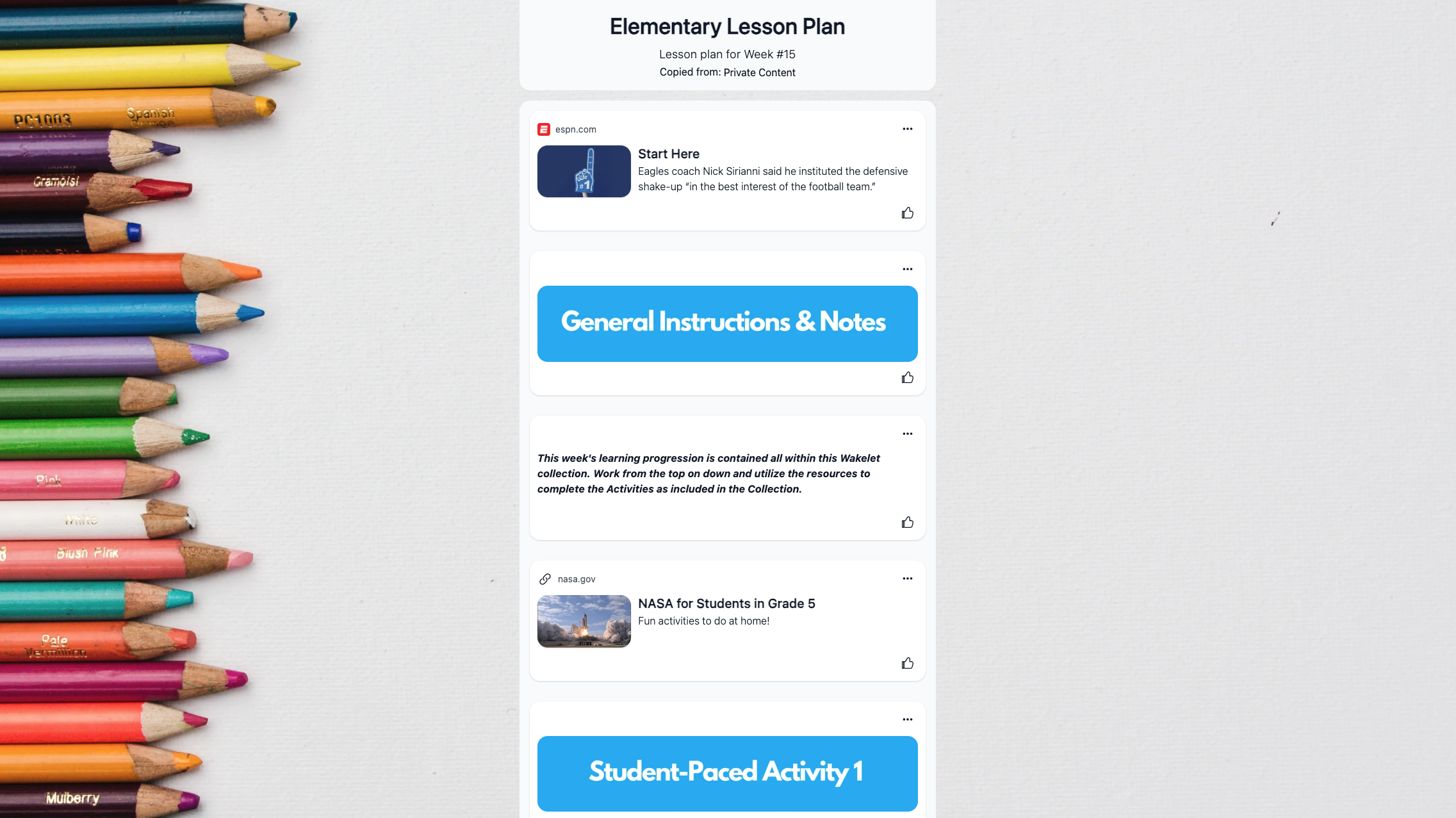
01. Media View
Are you interested in sharing your story on Wakelet? Consider trying out Media View! The sleek display is visually appealing and easy to navigate. You can scroll through your collection, with all your items neatly organised in a vertical format.
This layout offers an order to your collection, which is great for storytelling!
Example - Elementary Lesson Plan ✍️
02. Compact View
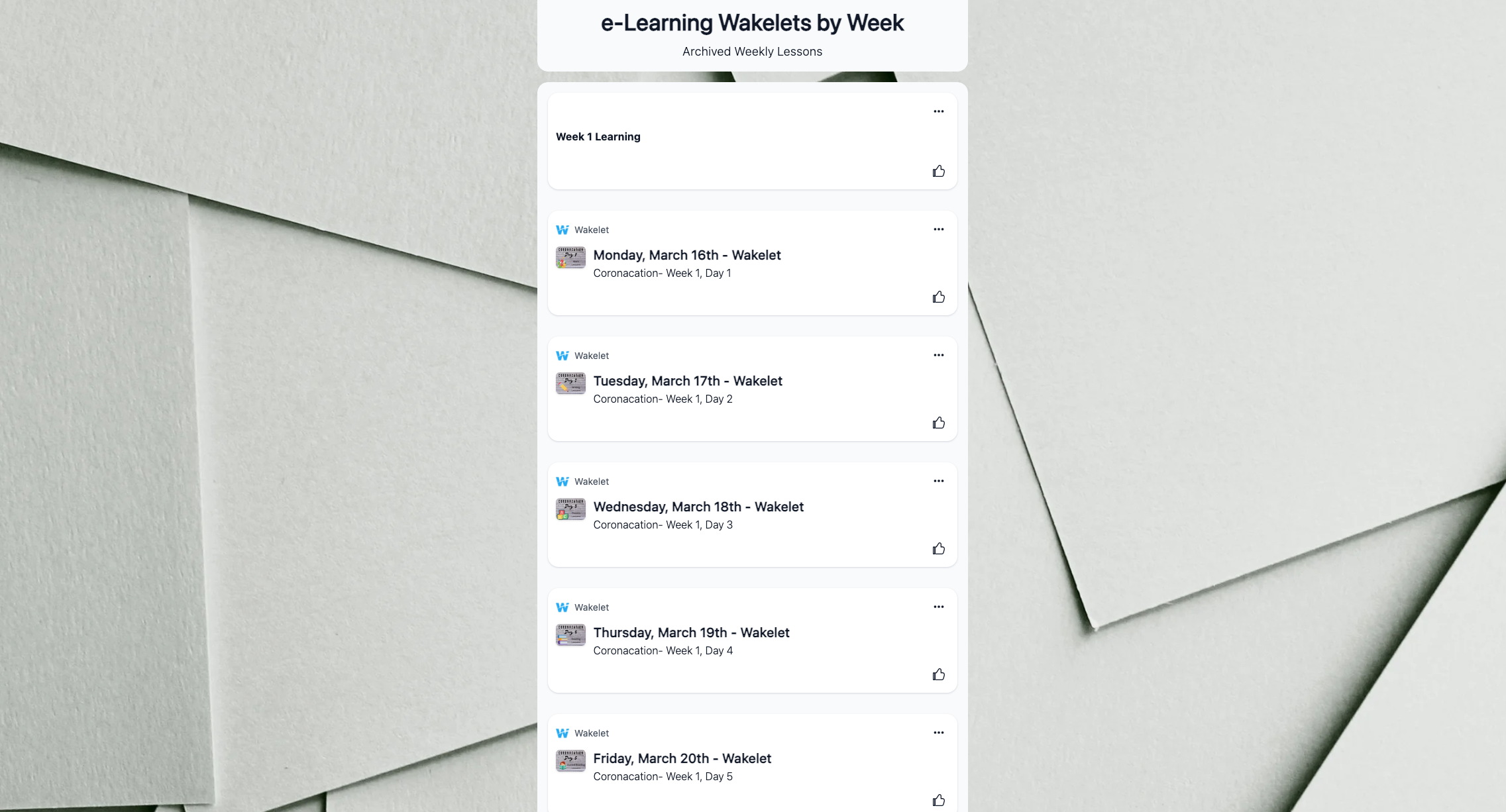
Are you a fan of simplicity? If so, you will appreciate Wakelet's Compact View! This layout is perfect for organizing collections with a large amount of content.
When you're taking some time in the afternoon to gather all the memories from your summer vacation, Compact View provides a convenient and organized space for storing a large amount of photos, videos, text, and more. Relive those sunny afternoons and seaside naps with Compact View on Wakelet!
Example - E-Learning Wakelets by Week 🏫
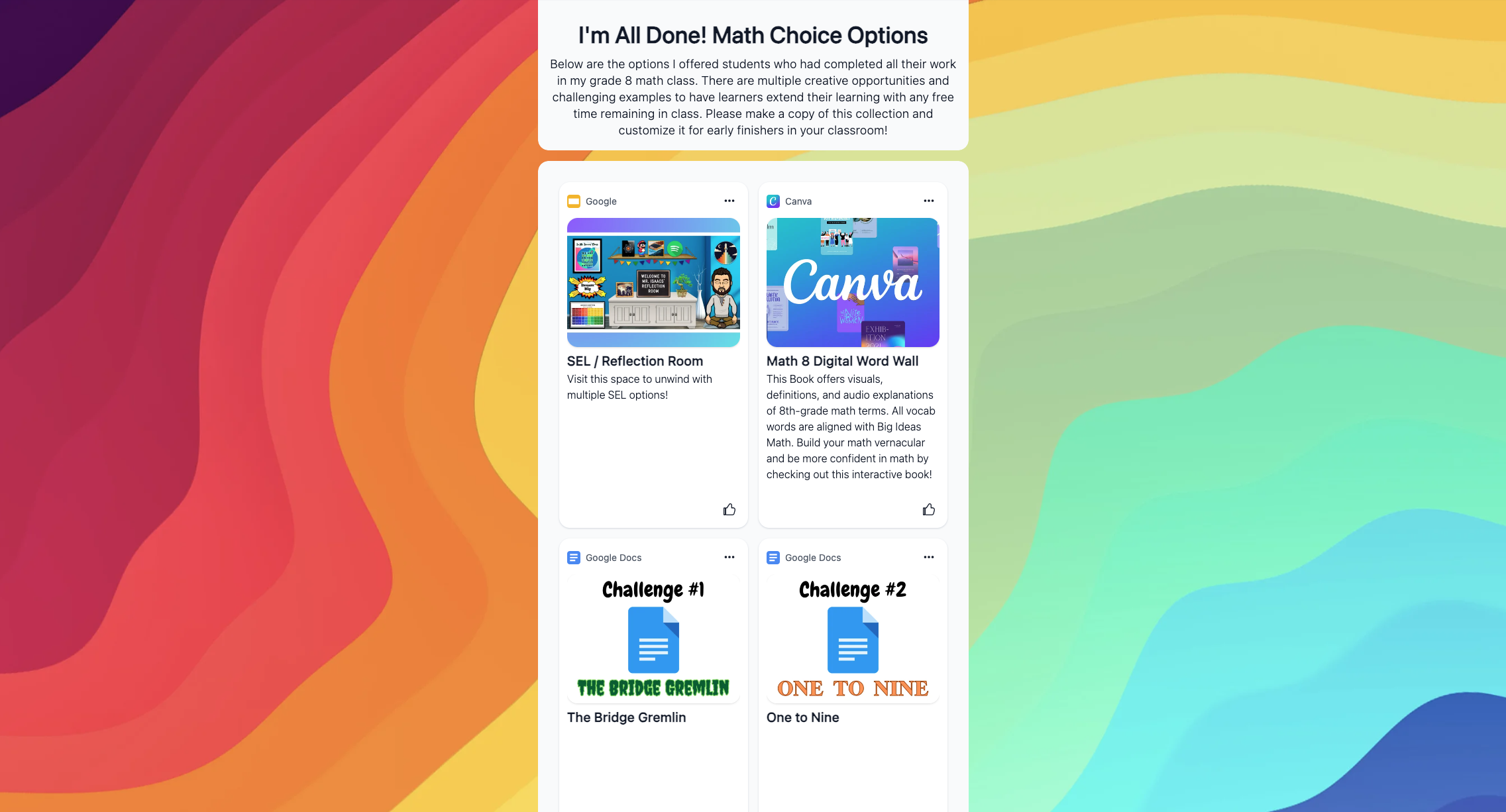
03. Grid View
Be sure to explore the Grid View layout! This innovative tile presentation is visually striking and ideal for organizing your photographs. Think of Wakelet’s Grid View as your digital photo album.
Wakelet’s Grid View is also great for comparing different types of content. Whether it's screenshots, text boxes, images, tweets, or videos, this layout provides an overview of all your items, allowing for easy comparison, contrast, and analysis.
Example - Math Choice Options ➕
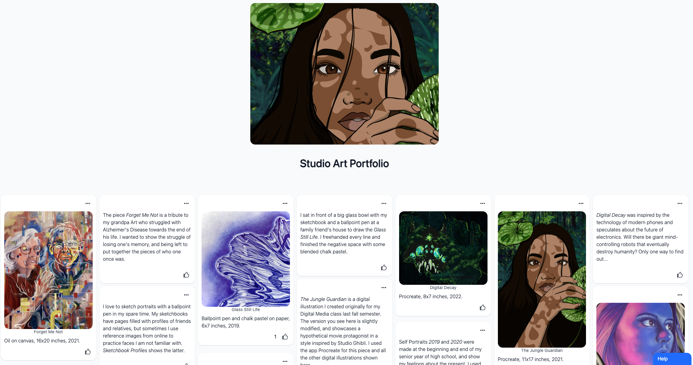
04. Mood Board
Wakelet's Mood Board layout is a fantastic option for collections with diverse content types. Images, social media posts, videos, and text boxes come together seamlessly in a Mood Board. This layout encourages personalization, so let your creativity shine! We're excited to see the unique ways users will utilize it. The mood board layout is also great for group projects or student collaboration activities. A mood board allows everyone to add different pieces of content without having to worry about the layout.
Example - Studio Art Portfolio 🎨
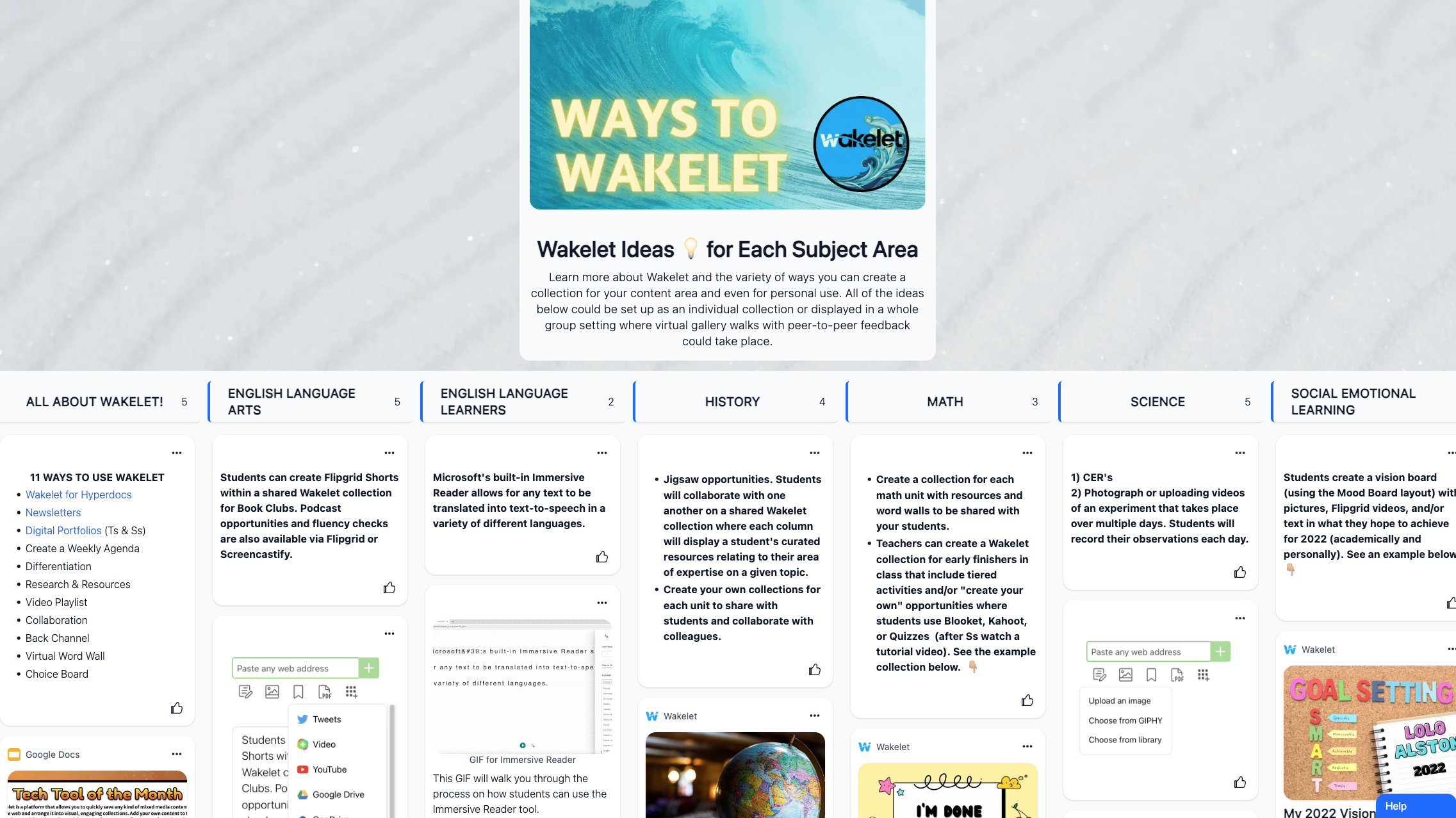
05. Column Layout
Example - Wakelet Ideas for Each Subject Area💡
Wakelet's Column Layout offers a sleek and professional presentation, perfect for highlighting key information or showcasing a step-by-step process. Whether you're creating a visual timeline, outlining a project plan, or curating resources for a lesson, the Column Layout on Wakelet provides a structured and appealing format. With easy navigation and a clear flow of information, this layout is a great choice for keeping your audience engaged and informed.
Begin creating your collection for free and select your preferred layout to bring your vision to life. Get started at Wakelet.com!

%20(1).png?width=1800&height=100&name=Get%20started%20for%20FREE!%20(900%20x%2050%20px)%20(1).png)
