Choosing the Right Layout For Your Collection
Above all else, Wakelet is a platform for your creativity and every aspect of Wakelet is tailored towards letting you present your collections in the best way that suits the contents. That’s why we don’t offer just one way to display your collections, because every collection is unique and what works for one type of collection might not work for another.
Once you’ve curated your collection or even during the process, take some time to play with the different layout options available and you might just see your work in an entirely different light.

Media View is the default option when you create your collection and is perfect for collections with a diverse range of interactive content. Mix in a YouTube link with a Spotify playlist followed by a Facebook post and a Twitter thread and the content not only displays as it would within its native platform, but you can access it without leaving Wakelet.

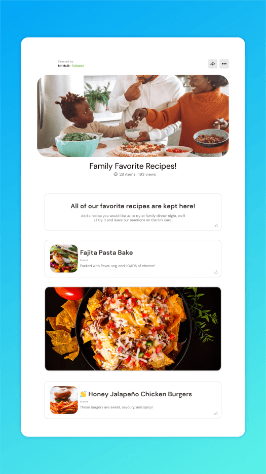
Media View is great for newsletters as you can mix in text updates with videos, images and social media posts in a visually engaging way that invites readers to keep scrolling. Use headers or even images to break the collection up into different sections or freestyle it with a mix of content, Media View is a versatile way to share your content with the rest of the world.

Compact View is similar to Media View in its verticality but while it loses some of the interactivity of Media View, it can be less overwhelming for collections with a lot of content, especially if it’s predominantly links and files. Sometimes you just want somewhere to host all of your content in a neat, easy to digest way and whether it’s a link, a PDF, a Google Drive document or whatever else, Compact View is great for getting everything down in one place.
A great use for Compact View might be for a bibliography or an online research folder. Keep everything organized in different collections for different aspects of your research and move items around to tell a chronological story of work. Not every Wakelet collection has to be public, so if you’re looking for a more private curation experience, then Compact View might be best suited to your research needs.

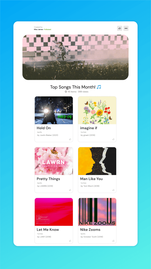
Grid View expands your collection into two columns and displays the content in a more square shape, allowing viewers to view items side by side. It doesn’t have the interactivity of Media View but it is slightly more visually engaging than Compact View, which makes it a better choice for image based content.

Grid View is great if you want to compare or link certain items together; maybe post a Spotify link to a favorite album next to a review of that same record, or a picture from a video shoot next to the video itself. The side-by-side column aspect of Grid View allows you to think differently about how your collection looks and allows you to approach Wakelet from an entirely different perspective.

Mood Board is like a mix of the interactivity of Media View with the broader presentation of Grid View, with content presented as different sizes depending on what type of link or file it is. Mood Board is great if you want a visually striking collection and is especially great if your collection is predominantly image or social media focused.

If you’re looking to build an online portfolio, then Mood Board can be a great way to get a lot of content in one place without making the viewer scroll too much to see everything you have to offer. It’s also great for collaboration, allowing multiple posts from multiple users to sit next to each other in a way no one item takes prominence.

Assembling your content is just the first step in curating your collection and choosing the right layout can bring everything together in a way you never even considered. Take your time experimenting with all four display options and move your content around with intuitive drag and drop functionality to make the most of your content.
